Texts explain figures (in writing)
In academic writing, we very often provide figures to explain, for example, experiment results. The correct way of the explanation should be texts explain figures.

In academic writing (and we think for other types of writing as well), we very often provide figures to explain, for example, experiment results, methods, graphs and illustrations. However, many of us still have a wrong paradigm, that is figures explain texts. The correct way should be texts explain figures. The saying of “A picture is worth a thousand words” is not valid here.
Texts explain figures
A single figure in academic writing contains a large amount of information. This information cannot speak by themselves. Instead, we need to clearly explain the information contained in the figure in the text of an article (even with only, let's say, two sentences). The explanation in the text will ensure that there is only one interpretation of the figure and the information is correctly conveyed to readers. Some examples of the explanations we can provide in texts of an article are explanations about, for example, data abnormality in a figure, experiment conditions to obtain results shown in a figure, methods used to take data, discrepancies between a model and experiment data, the mathematical model of the data in a figure and the method used for data fitting.
Three examples are provided in this post to explain the concept of texts explain figures. With these three examples describing totally different conditions, we hope that you can understand the concept. All the examples use variable ‘A’ and ‘B’. The variables can represent anything in real situations. For these examples, we can say that ‘A’ represents a process parameter and ‘B’ represents an output of the process and these variables are considered unitless for generality.
(Note: All numbers, figure captions and analyses in the examples are just made up, not real and are only for the sake of clarity. We use “present tense” style of explanation. All figures in this post are generated by Python programming language).
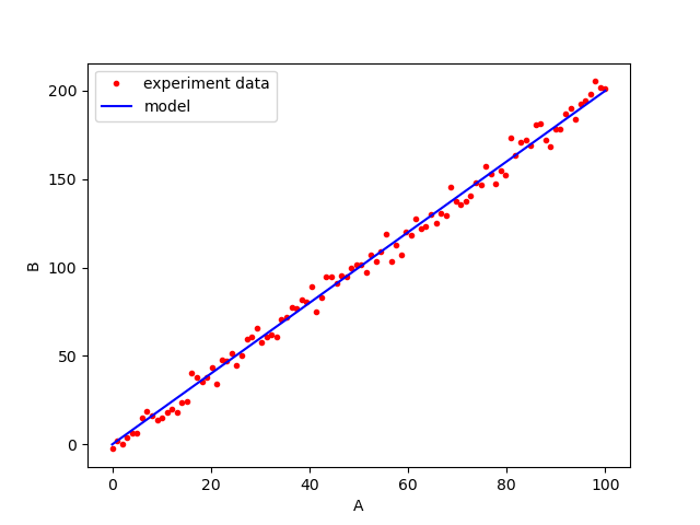
Example 1
This example uses the simplest form of data presentation, which is a linear regression between two variables.
Figures explain texts paradigm:
The process parameter of the experiment is set from 0 to 100. A total of 150 experiments are conducted in a temperature-controlled laboratory. To model the experiment data, we use a first-order linear regression without an intercept. Figure 1 shows the results of the experiment and the linear regression fitting. From the results, the process parameter A positively affects the output B.
Texts explain figures paradigm:
The process parameter of the experiment is set from 0 to 100. A total of 150 experiments are conducted in a temperature-controlled laboratory. To model the experiment data, we use a first-order linear regression without an intercept. Figure 1 shows the results of the experiment and the linear regression fitting. In figure 1, the fitted regression model is $B=2A$ with $R^{2}=0.99$. With the $R^{2}=0.99$, the model represents $99\%$ of the total variance of the experiment data and can be considered valid. The mean square error (MSE) of the model is $0.2$. From this MSE value, the noise of the experiment data is considered small. This small experiment noise is due to the temperature-controlled environment.
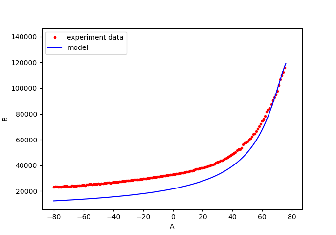
Example 2
In this example, a more complex situation is presented where there are some degrees of disagreement between a model and experiment data.
Figures explain texts paradigm:
The experiments are conducted on a shop floor and the process parameters are set from $-80$ to $+80$. A total of $100$ tests are conducted. The time required to conduct each test is approximately five minutes including the warming up and cooling phase of the process. An exponential model is fitted to the experiment data and is shown in figure 2. From figure 2, we can observe that the fitted model can generally model the trend of the experiment data.
Texts explain figures paradigm:
The experiments are conducted on a shop floor and the process parameters are set from $-80$ to $+80$. A total of $100$ tests are conducted. The time required to conduct each test is approximately five minutes including the warming up and cooling phase of the process. An exponential model is fitted to the experiment data and is shown in figure 2. The resulting fitting is $B=2e^{A}$. From figure 2, there are some discrepancies between the fitted model and the experiment data. These discrepancies are due to higher-order factors that are not considered in the model, for example, the effect of temperature increase from a reference temperature. The $R^{2}$ value of the fitting is $0.72$, meaning the model can represent around $72\%$ of the total variance of the total data with mean squared error (MSE) of $5.25$. In figure 2, at a high value of process parameter, the model agrees well with the data. This good agreement might be due to the fact that large values of the parameter A ($>70$) cause the effect of the ambient temperature becomes less significant to the output B compared to small process parameter values ($<70$).
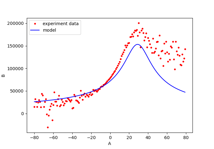
Example 3
This final example presents the most complex situation compared to the previous two examples. Besides some disagreements between a model and experiment data, high noise in the experiment data is also presented.
Figures explain texts paradigm:
In the experiment, a total of $100$ tests are carried out in a temperature-controlled laboratory at $20^{\circ} C$. In addition, the experiment is conducted by an experienced operator. Figure 3 shows the results of the model fitting to the experiment data. Some discrepancies between the model and the data, at process parameter value of $> 10$, can be observed in figure 3.
Texts explain figures paradigm:
In the experiment, a total of $100$ tests are carried out in a temperature-controlled laboratory at $20^{\circ} C$. In addition, the experiment is conducted by an experienced operator. Figure 3 shows the results of the model fitting to the experiment data. An inverse-squared model is used for fitting the model to the experiment data. The $R^{2}$ value of the fitting is $0.73$ with a mean squared error (MSE) of $15.2$ between the fitted data and the experiment data. From the $R^{2}$ value, The fitted model explains $73\%$ of the total variance of the experiment data. High noise on the output data at process parameter values of $ < -10$ and $> 10$ can be observed in figure 3. This noise might be due to the instability of the machine’s clock oscillator used in the experiment for those process parameters values instead of temperature variation. Because, the experiment is conducted in the temperature-controlled room where the temperature is controlled at $(20\pm 0.5) ^{\circ} C$. At process parameter values of $> 10$, power gain causes the output from the experiment to be larger than the output from the model prediction.
In conclusion, we should always put explanations of a figure inside a text so that readers can, if possible, understand the information in the figure by reading the text without seeing the figure or at least can understand the figure quickly without ambiguity.
We sell all the source files, EXE file, include and LIB files as well as documentation of ellipse fitting by using C/C++, Qt framework, Eigen and OpenCV libraries in this link.
We sell tutorials (containing PDF files, MATLAB scripts and CAD files) about 3D tolerance stack-up analysis based on statistical method (Monte-Carlo/MC Simulation).